Indicator and Status Drop Zones
Status indicators are used in grids and gauges to visualize the status of a given measure for each data point. The indicator and status drop zones are used to create these visualization effects in grids and gauges.
Grids
The Indicator drop zone is enabled when working with tabular grids, allowing you to add a single measure which will drive the indicators in the grid. By default, the status indicator does not include any color logic; however, you may add a measure to the color drop zone and select "Indicator" as the target, in order to add color logic to the indicators. Click here to learn more.
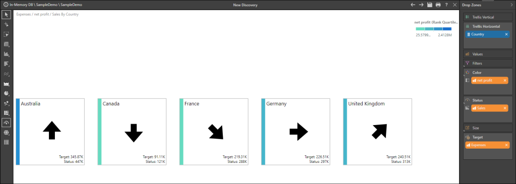
Gauges
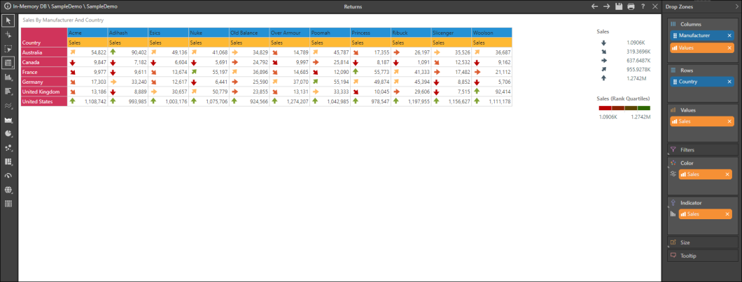
The Status drop zone is enabled when working with gauges; add a measure to the Status zone to add indicators to the gauge.
You may add multiple measures to the Status zone; in this scenario the gauges will automatically be trellised by the given Status values.
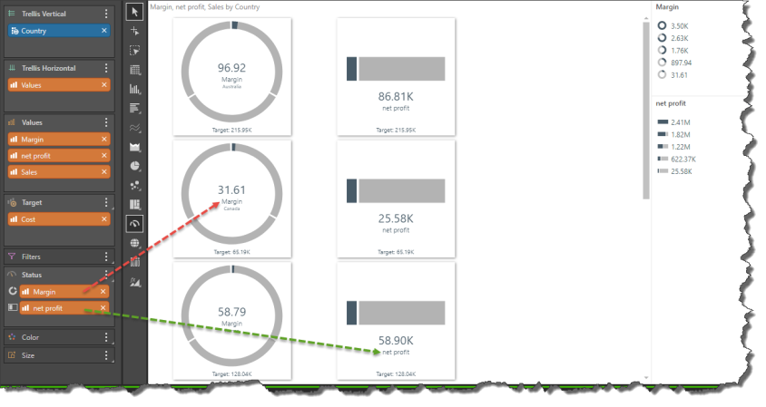
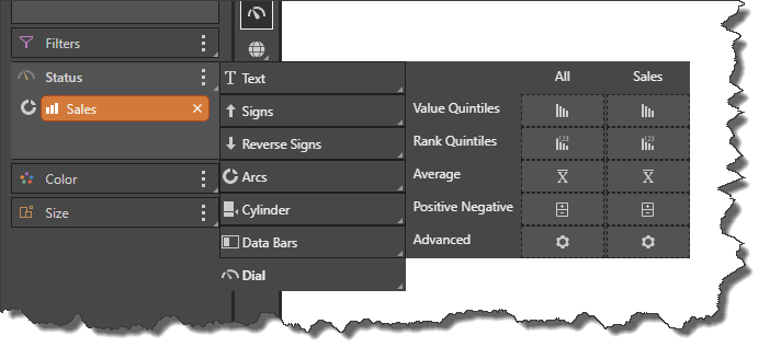
By default, the indicators do not have any color logic assigned to them (with the exception of Cylinders and Dials); you can assign color logic to the indicators from the Color drop zone.
In this example, the Sales measure is driving the status indicators, while the Net Profit measure is driving the sidebar color indicator.
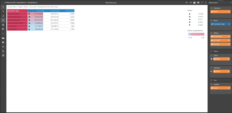
KPIs
Custom KPIs are comprised of an actual value, target value, and status value. Status values are a logical comparison of the actual to the target to express whether the actual is doing better, worse, or the same in comparison to the target value. In queries, the status values appear as numeric ranges or bands, which define the status of the actual value compared to the target value.